Overall, I decorate with a very neutral color palette, adding minimal color and interest in art and antiques.
This holds true in my bed lines too. Normally I have shades of creams and taupes, with some yummy texture in a knitted throw.
This holds true in my bed lines too. Normally I have shades of creams and taupes, with some yummy texture in a knitted throw.
I was ready to change out my bedding for the summer. I found a duvet I loved but it was $565.00.
Choke. Sputter. Gasp.
So, that got the stubborn streak in me riled up, and I decided instead to do all new bedding (minus my linen sheets that I will never swap out cause I love them so) with fabrics and items I already owned.

And this was my results!
I love crisp white in summer bedding, so I already had this cotton/linen coverlet, so it made the 'cut'.

I have my 4 linen pillows stacked in the far back. The ruffled brown shams I have owned for quite some time. They are a very odd shade of faded brown, but in this ensemble they look great. I even had all these pillow inserts, and made the covers to fit them... cheap!

The linen pillow covers are made from left over fabric from a prior project. I loved the raw end of the fabric and thought it was much more interesting than a hemmed edge, so I incorporated it into the design of the cover.
I found this giraffe print ribbon back at Christmas, and I have put it in so many projects since that I may be tipping over into excessive... but don't tell me if I am... I prefer to remain in my giraffe print happy place!

And this chunky weave loveliness is actually a blue ticking table runner I bought over a year ago (actually I bought 4 of them) on sale at PotteryBarn. Regular priced $54, Clearanced to $9 each. Scarf! Each table runner is forever long, it took only one to wrap around this pillow form and do an envelope opening in the back, and I still had leftovers.

This is the EXACT fabric that the expensive duvet I wanted was made out of. I already had this yardage fabric that I got long ago with Hobby Lobby coupon, and had just enough left over from other projects to make a lightweight throw to go at the foot of the bed. Yay!
This is actually the most pattern I have had on my bed in forever... I quite like it!
The browns in this print beautifully tie in the deep chocolate linen of the tufted headboard, the odd brown in shams, and the hemp of the table runner pillow.
I swoon over the grey blues! Heaven! I also love the fun farm toile with a wink towards our own place.

Crisp and cool just as I had pictured it in my mind's eye.

Have I ever showed you one of my all-time favorite art finds?
I found this gigantic piece of loveliness at a furniture store, of all places. It is an original oil painting. I was told it was by a local artist but they didn't even sign it... can't imagine being capable of such work and not signing IT!
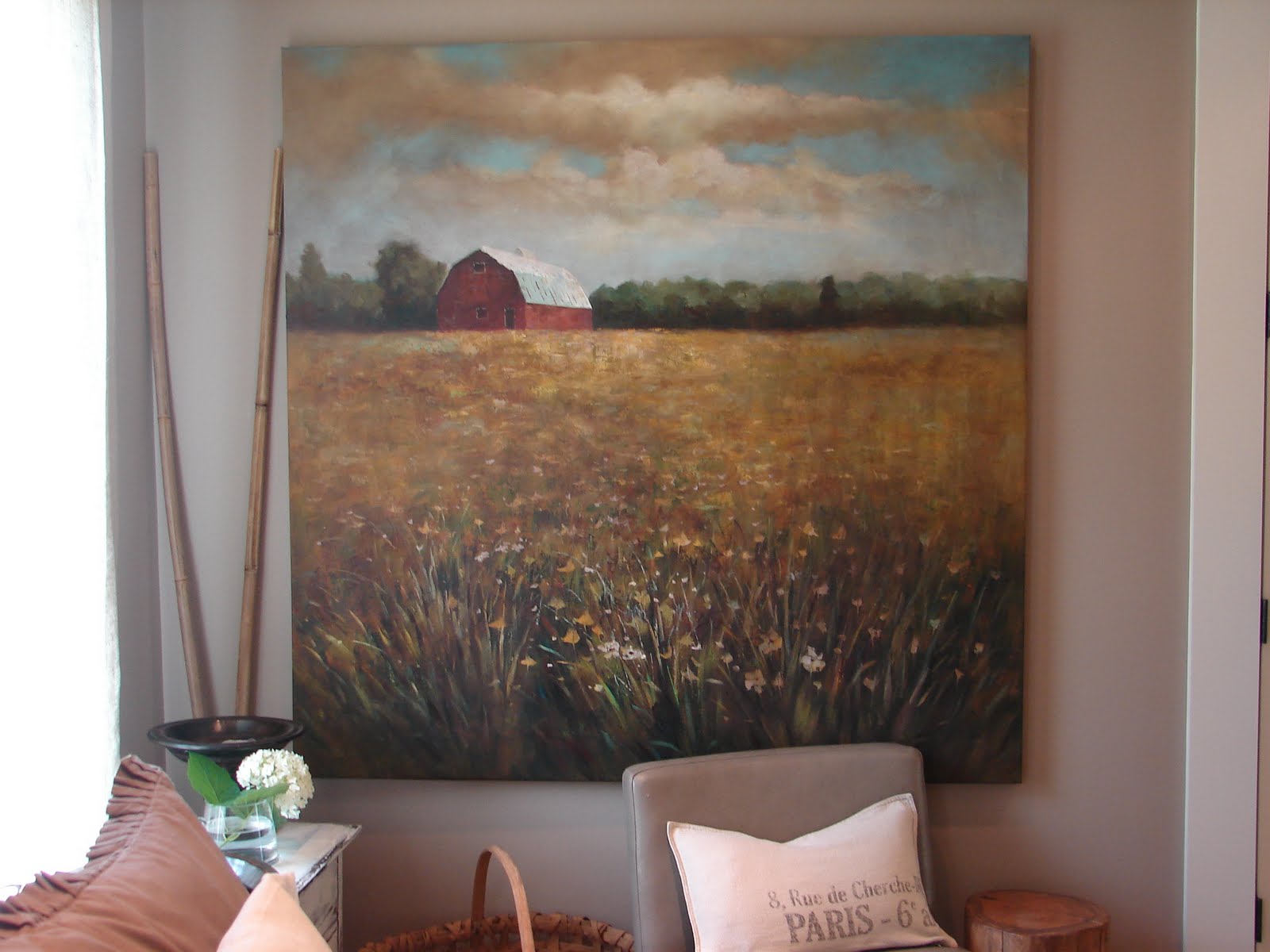
This is where I admit to an art No-No! I so loved this piece, so very perfect for our farm... but when I originally bought it, the colors were very vivid! Like extremely, very, very, vivid (attempts at condoning my actions). So I made a 'wash' of umber paint and brushed the wash over the top of the painting. It muted the whole palette down, not omitting the colors by any means, but bringing the overall feel of the piece more in line with the tones in my house. Do you think the art police now have a warrant out for my arrest?

These photos do no justice for the exquisite brushstrokes, especially in the meadow. Sigh. In love.

Our master bedroom is still evolving. But this is one of our newer furniture pieces. I found this cabinet at Crate & Barrel. Its proportions are perfect for this nook by the fireplace. It will eventually hold all the electronic mumbo jumbo that it currently heaped on the mantle waiting for the flatscreen tv to be mounted, etc, blah, blah, blah.... husband? are you reading this? honey? will the electronic extravaganza ever be hidden away behind these lovely cabinet doors? honey? sweetheart? love?

Design note, do you walk into a room sometimes and know immediately that it 'works', but not sure why?!
The answer is usually the use of subtle repetitions.
Case in point here... the square grid on doors of cabinet reference the square tufting on headboard, reference the huge square art canvas, reference the square slate tiles on fireplace.
Your eyes love repetitive elements and will cause your senses to approvingly absorb a space without you even really knowing why..... but NOW you do. Give it a test. Find a picture of a room you love in a magazine. Pick it apart... you will notice repeats in color, shapes, and/or textures, etc. Its how we are wired!

K,
I am now stepping down from my amateur, absolutely no formal training, but instead small fortune spent on design books, novice of the most dangerous type, interior design SOAPBOX.
And I'll leave you with this snapshot of my husband's side of the room. Ummmm, tad unfinished I would say. Someday, I want an art ledge dripping with art and photos and 'finds' that speak of he and I. It will be fabulous... someday. Thought. Maybe 'someday' would come about much sooner if my creative urges were not so terribly distracted by the mess of cords and whatnots on the mantle. Just sayin'.

3 comments:
I have found some great art pieces at furniture stores! I expect a full tour next week!!
Ok... we sooo need you at our house!! badly! i don't think the artist of that painting should mind you tampering too much, considering that they didn't even sign it!
I think muting the colors is genius, not a no-no. I like the idea of contributing to make the piece YOURS. I've even seen people in the blog world painting parts a different color entirely, and I'm tempted to try one day myself...
Post a Comment